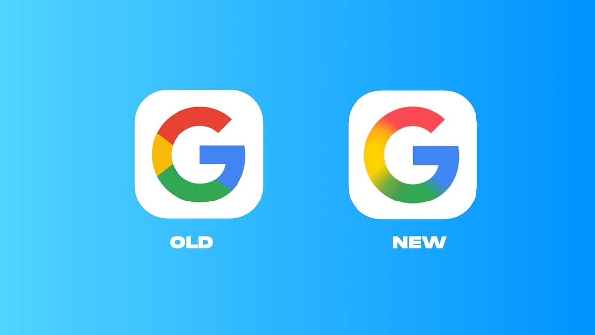
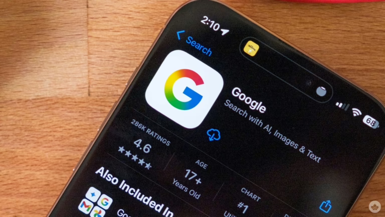
Google has unveiled a refreshed company logo, marking its first significant redesign in ten years. The updated emblem features a vibrant gradient that smoothly merges the four signature colors of the iconic “G” into a continuous, radiant flow.
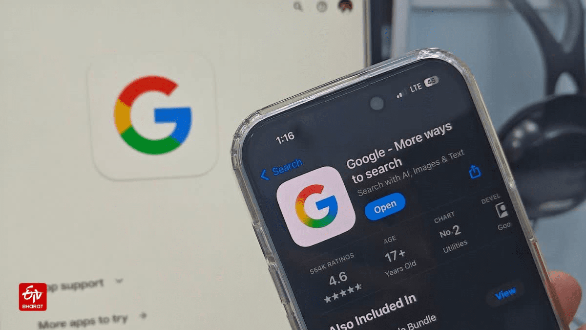
Earlier this year, Google initiated a limited rollout of the new logo on select Android and iOS devices as part of a testing phase. The tech giant confirms that this refreshed visual identity will soon be implemented across all its platforms. The update extends beyond the “G” icon, with subtle tweaks made to the Google Home logo to maintain design harmony.
Users can anticipate a revamped appearance across popular Google services such as Gmail, Drive, Meet, and Calendar. This redesign represents the first major evolution of Google’s primary logo since 2015, when the company introduced the segmented multicolor “G.” The previous fragmented style has now been replaced by a unified gradient, aligning Google’s branding with its Gemini AI platform’s aesthetic.
Closing a Decade of Visual Consistency
The logo introduced in 2015 stood as one of Google’s longest-lasting designs, embodying a minimalist and digital-friendly style that suited the company’s direction at the time. Over the years, Google made minor adjustments to its app icons-such as Gmail, Drive, and Photos-to improve clarity and keep pace with evolving design trends, but the core logo remained unchanged, reinforcing a strong brand identity across billions of devices worldwide.
This latest update breaks that decade-long visual continuity. By embracing a gradient effect, Google is streamlining its visual language, creating smoother color transitions that enhance appearance on high-resolution displays and in dark mode environments, which have become standard on modern smartphones and laptops.
The new design also brings Google’s main logo closer in style to its other products. For instance, the Gemini AI platform already sports a gradient logo, and this redesign helps unify Google’s overall brand image, offering users a more seamless experience when navigating between search, productivity tools, and AI services. The rollout will be gradual, ensuring a smooth transition.
Related: Google Chrome: Emerging Security Risks and How to Stay Safe
Some users might spot the new logo on individual products before it appears universally. During the transition, certain apps and websites may display both the old and new logos simultaneously. This phased approach is typical for Google, allowing the company to monitor feedback and address any issues prior to a full-scale global launch.
Comprehensive Rollout Across Google’s Ecosystem
The redesign focuses solely on the visual aspect of Google’s services, with no changes to functionality, performance, or features. The gradient logo will be integrated across all Google platforms, including core services, third-party apps, and hardware products.
Devices like Google Nest and Google Home speakers will receive software updates to reflect the new branding. Additionally, mobile app icons, browser tabs, and sign-in pages will adopt the refreshed look. Workspace users will gradually see these updates across their suite of productivity tools. Google anticipates the full transition will span several months.
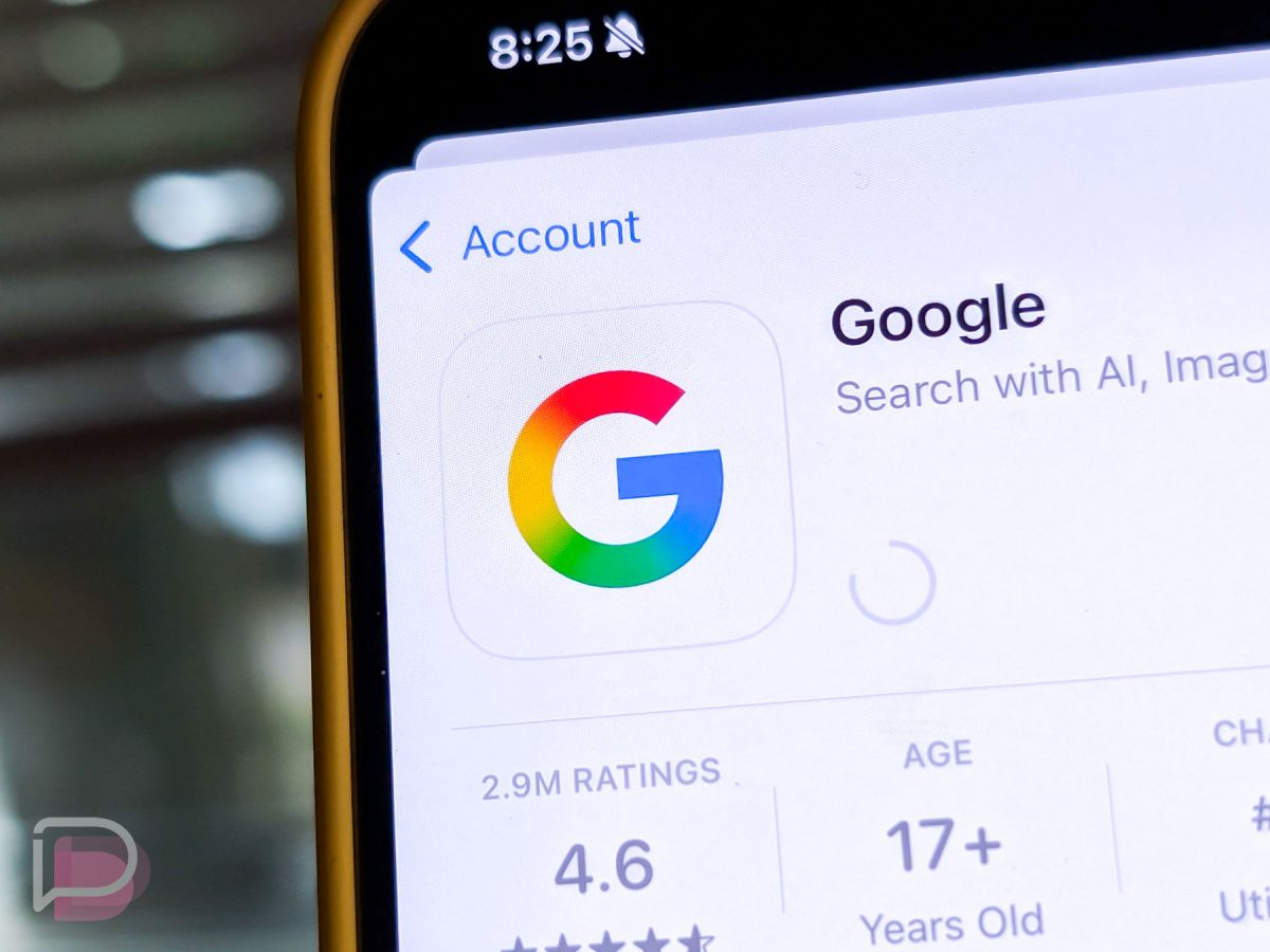
For many, this represents the most prominent branding change from Google in recent years, as the company has not overhauled its visual identity since the 2015 logo family launch.
The updated gradient design ensures consistent color presentation across various devices and screen types, simplifying brand uniformity and easing integration into future products.
As Google continues to expand its portfolio of devices and services, the sleek gradient “G” will act as a unifying symbol across its ecosystem. Users can expect to see the new logos appear throughout Google’s offerings throughout the year, with ongoing updates to websites and applications until the rollout is complete.



0 Comments